Category Archives: Calligraphy As Art

Taking the art of calligraphy to a new level

What is so Special About The Story of Jasmine?

     The Story of Jasmine is truly unique and remarkable—not only from the standpoint of the story being told but from other key aspects as well. I thought I would help my supporters understand why every installment is unique and remarkable.
     It’s not supposed to happen like this…
    … to freshly present a finished installment to readers at the same time the story is being conceived is unheard of. But here we are.
The Writing
     Books usually go into production after the ideas have already been conceived and written down, sculpted and rewritten, then edited and proofread. The amount of text is known. When planning a publication, designs are based upon knowing beforehand the sizes of all the elements needed to be in the layout.
     The Story of Jasmine is in perpetual idea form. I can truly say I only have a vague notion of where the story is going. And I don’t know how the story ends. I am trusting that the creative process will take me where I need to go and everything will get resolved in a spectacularly satisfying way.
     The way I process information is a factor in my creativity. Not only am I a visual thinker, but a spatial thinker as well. I see things in terms of their orientation in space (and time). When I’m writing, I often get a visual of how the story appears on the page.
     I record ideas as they freshly occur to me and reason out the in-between stuff. I’m often surprised at what is gets revealed in the narrative that had never occurred to me when piecing known elements together. To update the newest information in my head is to integrate it.
While I’m in a more linear mode, I ponder why newly revealed details would be important and how they might affect the other characters. All I really have to do is pose the question to myself and I’ll (eventually) receive an answer. However, the story usually comes when I’m engaged in a physical activity, such as housework.
     Maybe I’m sweeping the floor when a part of the drama unfolds before my eyes. I’ll continue my activity until the “clip” is finished. As a visual thinker I “see” the characters in motion. Then I’ll go over the scene in my head, again and again—while still sweeping—so I understand it from each character’s perspective.
****I’ve read research that suggests that doing something physical while trying to learn something reinforces the ability to remember. It might be why when talking with a friend while on a walk, I would be able to reconstruct our entire conversation later when taking the same route. The memory is tied to different features, such as walking over peculiar cracks in the sidewalk or pausing in front of a tree. I’m apt to agree with the study.  But I digress… ********
     Each published installment is a single scene that represents a complete thought. I decide whose viewpoint would most effectively advance the story for the reader. I only begin writing in earnest when phrases start coming in.
Design
     Writing might take a couple of hours or three days. But as soon as I am finished, I transfer the raw text electronically and import it into Photoshop. First, I see how much text there is to work with. If there is little text, the illustrations become larger, vice-versa.
     This is the point where I edit the text. Appreciating the text in the context of the page is where I begin to assess the design. The text becomes units or blocks that have spatial relationships to other blocks. Visually, some blocks need to be filled when the lines are too short. I solve these visual problems by adding or losing words. It’s a matter of choosing different words to convey the same meaning. If I want to increase the size of an illustration, I may toss out a paragraph.
     This more organic method flies in the face of conventional graphics design where an established grid dictates the size and relationships of the units. For aesthetic considerations, I rely upon my eye and my artistic sensibilities to make the page a joy to behold because I’ve internalized the rules and understand how to break them.
The Jasmine Font
     A large part of my page aesthetic is due to the font. I designed my Jasmine font based upon the calligraphy I used in 1980 in some installments of The Story of Jasmine published in The Dragon magazine.
     The text font is the italic version of the Jasmine font. This is another departure from convention. Italics is seldom used for large blocks of text because italics is too hard to read: it is usually reserved for captions instead. Roman (upright) and Regular (medium weight) versions of fonts are normally used for blocks of text.
     When I first used my font, I was still renovating the original panels and wanted to replicate their size and look. The Jasmine italics font is the same size as the calligraphy was on the original panels—large—so readability is not an issue.
Illustration
     Then I decide what needs to be illustrated. Often, within an illustration’s progress, I may change the text to better describe the action, which may increase or decrease the size of the art.
     Often, no illustration decision is necessary. I simply re-create what I saw in my mind’s eye when my creative muse showed me a clip. I admit, I often receive material enough for several pages. So it’s a matter of being discerning. If I wish to feature a certain scene, I manipulate the text to accommodate an illustration, balancing the elements of the narrative between three panels or more.
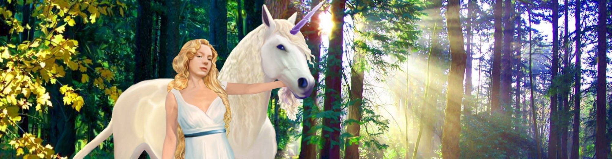
     I chose to make the characters ultra-realistic looking. I wanted to f—k with the notion of reality impinging upon fantasy … a story documentary in page form. The realness of the characters feeds the realness of the tale. This very story just might be happening out there, somewhere, in another reality…
Publishing
     From conception to finished layout and art, the process takes about a month. With Patreon’s monthly deadline, I feel honor-bound to my patrons to produce at least one installment each month. During the month, I weave together many different creative disciplines. But whatever I do, the result is fresh and in-the-moment.
     Where actually does the story come from? Is it my imagination or am I tapping into some other realm where all this is actually taking place? Do other writers wonder the same things too? Can’t it be both?
     Well, I cannot worry about how relevant a story is about a girl growing into her power even though I sometimes wonder if people are sick of medievally-inspired fantasies about kingdoms at war with evil. It doesn’t matter. This tale is being told whether or not our world is ready for it.
All I know is that my Patreon fans are witnessing a creative process that integrates several disciplines on an on-going basis.

The Birth of Jasmine Poster

Now Available

This Special Calligraphic piece of artwork, “Awaken–The Birth of Jasmine,” uniquely combines story writing, calligraphy / lettering, with illustration and layout. It is a study combining letters and art, using medieval sensibilities.

The lettering I used is based upon gothic calligraphy, a type of black-letter that was used in medieval northern Europe. These letters tend to be dense and strong, making the twin columns of text are visually strong enough to look like columns holding up a colorful archway.

Inside the niche, stands a young woman in a white dress with a red velvet cloak, holding a staff. A representation like this is reminiscent of how medieval artists and architects portrayed important saints and personages along with the tools of their trade.

_______________________

The original art was completed in 1984 and appeared in “Lettering Arts in the ’80’s” Ampersand Publications, MN. In 2008, I digitized it and in 2018, I’m making it available as a poster.

© 2018 DARLENE

What Good Are You?

It’s something my late husband, Vincent, and I used to light-heartedly joke to each other whenever one of us messed up.

Hand-crafted by DARLENE in 1997

“What Good Are You?” reflects our wacky, off-beat sense of humor. Of course, underneath it all was a foundation of appreciation and respect for each other.

I happened to find this card, which I hand-rendered and gave to him in 1997. Today, I decided to dust it off and offer it as a greeting card to other people who want an opportunity to express to another person just how great they are, even if they are unsure about it themselves.

As a hand-rendered card, I made the lettering disappear into the design. You have to search to read what it says. Then, once you figure it out, you do a double-take. Do you know your own Beauty? Many people do not. They are clueless. Thus, I offer this Friendship Recognition card at my Zazzle store.

Available here.

Jasmine Story – Snippet 10

Bardulf-Thaatur “Axewolf of the Darkness”

Bardulf is the main vilan of the story, at least at the very beginning.

Through treachery and a touch of magic, the dark prince used the mysterious Ring of Emeth to bewitch UR’s princess, whose proud beauty fascinates him. By placing the ring on her finger, she immediately fell under his spell. Intending to marry UR’s princess himself, he planned to secure the rich kingdom of UR for himself, With ambitions to conquer the whole of the Mid-Realm, the subduing of UR through political marriage was only his first step towards this goal.

Although he lost the princess due to the incompetence of his soldiers, he knows the loss is only temporary. He can always find her with help from the ring of Emeth. A dragon-lizard named Gryth is attracted to the ring. Through the dragon-lizard’s connection, he is able to “watch” Jasmine’s progress from afar. Jasmine cannot remove the ring. In the meanwhile, Bardulf pretends to the King of UR, pretends that the princess is in his stronghold, and that she has already consented to be his Queen.

________________________

I would have said that the above text is also from Installment 13. But after comparing it with the actual panel (below), I find that it is not. There is more and better information in my notes. I think space limitations caused me to abbreviate the ideas stated above.

This is the text accompanying Bardulf’s illustration. It’s from the 1st panel of Installment 13.

© 2018 DARLENE

Jasmine Story – Snippet 9

This share is not technically a “Snippet,” at least not in the way I’ve been defining it.

For clarification, the snippets I’ve shared thus far have been notes to myself, mostly recording the plot elements I needed to remember. There are some nice phrases, but not much actual attempts at writing.

As I’m in charge of my own rules, I share this panel of finished art. I’m allowing it because no one has seen it before. It’s from the 13th Installment of The Story of Jasmine, which was not published. I love this particular page design.

The third page of the unpublished 13th installment of “The Story of Jasmine.”

The previous two pages in this recap installment were both designed as two column pages with illustrations at the top and introduced the major players, two to a page.

The design of the entire 13th “Story of Jasmine” Installment was symmetrical. I felt choosing this type of unifying layout would aid readers who first encounter the story. To more easily grasp a sense of the plot, the text introducing the characters together with their portraits, provide a stable visual foundation.

But, by far, the third page, which mimics a cross, is visually satisfying to me. The text within the blue central panel states the essential purpose and objective for these characters to unite as companions of Jasmine. Both conceptually and visually, the central square unites the elements of the story and the page.

I like how the landscapes indicate something about each character and I’m especially fond of Ahearn’s illustration. But I do remember struggling with Thorne’s miniature painting.

This panel was created before the days of computers. Today, using software like Photoshop, editing an image is no big deal. However, everything drawn and written on the above panel — all images and calligraphy — were created directly on the illustration board, leaving no room for mistakes. At that time, I had to be careful because the production camera picked up any attempts at corrective measures, such as in the case of changing misspellings. I believe the illustration board was at a size, close to 100% reproduction size.

By the way, the text from yesterday’s share turned out to be from this panel. Should any other text that belongs to this page be found, I shall endeavor to point it out.

© 2018 DARLENE

Gallery of 12 Calligraphic Art Works

By no means exhaustive, the works within this Gallery were chosen for their unique qualities–like utilizing paper Darlene made herself, her experiments in combining calligraphy with photography, non-usual layouts, calligraphy etched onto glass, type face design based on calligraphy and angelic alphabets, etc..

GALLERY of CALLIGRAPHIC WORKS by DARLENE

Although Darlene started dabbling in calligraphy early on in high school using a Speedball pen and guidebook, officially, she dates learning calligraphy “properly” when she stayed in London in 1974 as her Field term at Beloit College. Her teacher was Dorothy Hammond, Craft member of the prestigious Society of Scribes and Illuminators.

Many years have passed since that time. Darlene has learned her craft from the “who’s who” in the Calligraphic Arts–Shelia Waters, David Howells, Ian Reece, Donald Jackson, and Thomas Ingmire to name a few. Along with a myriad of different scripts, she also learned quill making, vellum preparation, paper-making, Medieval Gilding techniques, marbling and book-binding. Darlene’s also taught calligraphy and helped to co-found The Wisconsin Calligraphers’ Guild. Her calligraphic works have also been published in several books.

About works within the Gallery:

Flower of Darkness. Darlene wrote out in calligraphy several depressing poems using different colored inks for each poem–pale blue, black, crimson–on black paper she created herself. Darlene also hand-bound the book which fits within a box she made in the shape of a coffin. The binding incorporates the accent of a paper sculpture on both the cover and coffin-shaped case. 1986.

Flowering Tree Roundel. After Darlene researched the different flowering plants associated with the 12 months of the year (according to Sun Bear), she arranged the information in a roundel, combining illustration with calligraphy. Likewise, the colors she used for the calligraphy were also associated with the months. 1988.

Albert Einstein Quote. This calligraphic piece, which incorporates illustration with text, was published on the front of the Wisconsin Calligrapher’s Guild Newsletter. It is one of her favorite quotes from Albert Einstein. 1981.

Dragon Alphabet of Decorative Caps. These Capital Letter project combines two things Darlene loves: letters and dragons. 2003.

Photographic Calligraphy. Darlene used her favorite Einstein quote in her photography class at Indiana University. The piece was created by brushing photo-emulsion onto a piece of paper and exposing the portrait image through a layer of acetate that she had calligraphied. When exposed, the places where the light could not get through shows up as reversed lettering. 1986.

Pasolini Quote. Darlene stayed in Italy, attending a 4-month Artist Retreat when she created this calligraphic piece on paper which she made herself. As the time wore on, many of her fellow artists got fairly depressed and this quote somewhat reflects the mood. 1983.

Manjushri. This is a fairly straight-forward calligraphic piece dedicated to Manjushri, the Bodhisattva of Wisdom. In Mahayana Buddhism, his name means “Gentle Glory.” 2006.

Voyagers of the Light. The calligraphy was etched on Glass. 1987.

Osiris, the Plant of Life. This calligraphy was produced using different ink colors for different lines of an ancient Egyptian poem. 1998.

The Power of Love. This is not calligraphy–this is a typeface Darlene designed based on calligraphy. It’s included it in this gallery because it looks fairly convincing as hand-work. 2006.

Troubadour Poem. On the occasion of a marriage, Darlene created a calligraphic piece reminiscent of an illuminated manuscript page, complete with borders and illustration. The illustration is also crammed with hermetic symbols. 2001.

Ophanic Characters. Darlene re-designed a 16th century angelic alphabet, known as Enochian but re-named as Ophanic, according to the principles of character readability. 2009.