![]()
I’m totally pleased to share my latest lettering commission.
I’m very proud of it and the client loves it. What more can I ask?
![]()
I’m totally pleased to share my latest lettering commission.
I’m very proud of it and the client loves it. What more can I ask?
The language of the unconscious uses symbols and colors as a part of its lexicon. The unconscious mind responds to colors emotionally. When you use color to consciously bridge communication with aspects of your self, it starts a conversation. Mindfulness coloring is being aware of your intent during the process while keeping your focus squarely within the moment.
There are no rights or wrongs. There are only feelings and experience. Whatever the outcome, in the simple process of coloring, different states-of-mind become accessed. [Tip: Simply switching the pencil to the less dominant hand in the coloring process will assure interesting adjustments.]

If I wanted to:
Bring more joy into my life, I would choose a yellow coloring pencil. I would either color my own Enneagram Type’s coloring page from “Dancing The Enneagram” with yellows and oranges, or I could color Type 7’s coloring page. I could also choose another page that has animals associated with happiness and joy, like the dolphins from the Peacemaker coloring page 18, shown above.
Here is a narrative demonstrating my mindfulness coloring.
To alleviate feelings of sadness, I would choose a palette of several colors and approach the coloring in stages, using the darkest first (dark blue, medium blue, turquoise, pink, yellow–with a surprise at the end). It’s important to develop a technique of using the side of a sharpened pencil to color a broad area and to lay down color with a light touch. The idea is to broadly go over the general area with the color, tracing the contours over and over again. The page gets darker with each subsequent pass as the color’s saturation builds up.
While your pencil is finding it’s path, it is imparting and picking up energy. Move your strokes to encompass more of the page. Give yourself permission to feel when you need to move on. Don’t get caught up in any desire to “finish” coloring any certain area. Leave it be for later, in a different coloring session. We are always a work in progress.
The point is, by first using light feathering strokes, you are able to layer two different colors together. Another reason you are using light strokes is because of the rhythm you create with the pencil strokes puts you in touch somatically with your deeper parts.
The beauty of the system I’m developing is that it by-passes the intellect. Having more to do with the intuition, there’s no need to process why, when, who, how–the only need is to watch the healing parts of yourself take over as you allow it. The healing works because we respond to symbols and colors on a deep, foundational level.
To begin…
Acknowledge your sadness by choosing a dark blue color pencil (like navy or even indigo). Find the Peacemaker coloring page (18) and just color bits of the background, because sadness is always in the background. Do not color the dark blue all over unless you are treading very lightly. There are many color blues in the ocean.
The waters of the ocean you are coloring represent your emotions. Consider the ocean as different shades of blue and in using different blues, you are honoring the depth and complexity of your feelings.
Now, choose a medium blue pencil and begin coloring next to the dark blue, gradating it out. Using a light touch, feather out the edges. Use the same technique with a turquoise pencil and continue coloring lightly where the medium blue left off and beyond.
Whatever recent issue prompted your coloring session, the blues represent your acknowledgment of your sadness. You have every right to feel what you feel. You honor the Truth of your feelings. The blues, quite literally, lighten up. Turquoise, with its bluish-green cast, introduces a hint of healing into the image as you color with the pure hue. Know that you won’t be blue forever.
Still using the turquoise, work your way up to the horizon. Using the lightest of strokes, concentrate on the sky closest to the water. Ascend your strokes, ever so subtly out of the water, out of the emotions, and up, into the horizon. Your pencil is till close to the water, (probably still wet 😉 However, now you have more perspective. Before you lies the expanse of the ocean, representing the innate wisdom of your Emotional Intelligence.
Now, you are free to pick up a non-blue color. Choose pink. Pink is white added to red. As a warm, active color, you are introducing quiet action. Continue to feather the pink over and quite beyond the boundary of the turquoise. Continue filling the sky with pink. Notice, what happens when the pink gets merged with the turquoise. Your eye blends the two to create another color. Behold–the result is a shade of purple. It’s magic! By yourself, you have introduced purple, the spiritual color of transformation!
Look! What a sunny day it is. Like you did with the pink color, take out a yellow pencil (confidence) and feather over the pink, making sure to preserve some of the pure pink hue (for the sake of aesthetics).
Notice a beautiful shade of peachy orange becomes created when the yellow rolls over the pink. Orange is known for its gentle, warming effect. Totally opposite Blue on the color wheel, orange is considered to be an antidepressant color, which exudes confidence and joy etc… FIN
Extra Credit.
Only when and if you feel confident enough, you can end the session by taking a purple colored pencil and going over some areas within the dark blue of the water. Symbolically, you’re adding the power of transformation into the waters of your deep emotions, making it easier to get out of a funk. The purple is an echo of the sky-color you created, literally adding a little bit of sky into the deepest parts of your sadness.
I hope this technique gives you a better idea about how to approach the act of coloring as a tool for transformation. The approach may be gentle and forgiving, but it’s surprisingly effective.
The coloring page is from “Dancing The Enneagram” by Kate Finlayson and myself available here.

HAPPY COLORING!
I’m very excited to announce our PlayBook,* Dancing the Enneagram, by Kate Finlayson and yours truly is now being printed for a June 1st launch.
 Last August (2018), I was at my friend, Kate Finlayson’s “Dancing The Enneagram’s” PlayShop in Charlotte. The experience with Kate’s effervescent energy was inspiring. I was so stunned and impressed with its power, on my drive back home, a vision to have her material developed in written form appeared to me.
That night, I furiously wrote. Within a short time, I created an outline for her book. I telephoned Kate and relayed to her my excitement. She asked me to present her with a sample chapter, which I did in short order. It seemed to me the book REALLY wanted to be birthed. And here it is: nine months later our baby is born.
The premise for “Dancing the Enneagram” is unique and ground-breaking. Kate, who is Nia-trained and certified, moves through each of the nine personality types. Her idea is to add a somatic component to an intellectual process, grounding one’s knowing into embodiment. Kate’s work is powerful and integrative.
Originally, I intended to present only Kate’s material, but an idea popped into my head to include the component of “coloring” into the mix because each of the nine personality types is also associated with a color. I’ve been working for a couple of years creating coloring books with positive images of maidens in their power to inspire “girls of all ages.” It seemed only natural to include what I know about coloring as a further means of integration, especially for those who have not experienced Kate’s energy in person.

I’m at my first “Dancing The Enneagram” PlayShop, August 2018.
Thus, in “Dancing The Enneagram,” I present the symbology of color, explain the difference between Light (RGB) and Pigment-based (CYMK) color models, and also offer a “Conscious Coloring” technique.
So the nine full-page illustrations I created for our PlayBook can be colored in or enjoyed as is. I’m also really happy to use one of my own font designs in the PlayBook. The design of the book exemplifies Beauty as is one of my best efforts. It’s epic!
*PlayBook and Playshop are Kate’s preferred terms over Workbook and Workshop. Learning shouldn’t be work.

“O” Dragon from NTRPGCONX
Just finished up on the design I’m doing for North Texas RPG Con X.
This dude is emerging from the “O” in CON and I thought I would share. There are 9 others moving in an out of the letters. Adding color makes the concept a little different than a one- or two- color design. I decided to sacrifice legibility for dazzle.
I thought I would share a part of a t-shirt design I’m currently developing.

Fragment of design for North Texas RPG Con X
The concept of dragons interacting with the letters and with each other is something I enjoyed doing for NTRPG Con’s tenth anniversary. I’m still working on it.
It’s fun. But, for a free design, the it is very complex to work out and quite labor-intensive. So I chalk it up to being a gift to the users.
I may be sharing other dragon letters in the future, depending.
It’s something my late husband, Vincent, and I used to light-heartedly joke to each other whenever one of us messed up.

Hand-crafted by DARLENE in 1997
“What Good Are You?” reflects our wacky, off-beat sense of humor. Of course, underneath it all was a foundation of appreciation and respect for each other.
I happened to find this card, which I hand-rendered and gave to him in 1997. Today, I decided to dust it off and offer it as a greeting card to other people who want an opportunity to express to another person just how great they are, even if they are unsure about it themselves.
As a hand-rendered card, I made the lettering disappear into the design. You have to search to read what it says. Then, once you figure it out, you do a double-take. Do you know your own Beauty? Many people do not. They are clueless. Thus, I offer this Friendship Recognition card at my Zazzle store.

I thought I would share the results of a commission I finished in July,2017 for Fireside Creations. I met them at last year’s Gary Con. Here is Eddie Jonas / Stephen Lee’s description for the Blue Dragon Cover artwork:
“The background is a pale blue sky with white clouds. There is a turning young male blue dragon that is using his lightning breath weapon upon a typical D&D party who are looking out from a floating oval portal that is suspended in the sky.
How we got there:
The room the party is in is a bedroom. They had just walked in, surprising the mage, who leapt through his stand-up oval mirror portal, changing to his true form, who has quickly turned and is attacking.”
I put a tremendous amount of loving detail into the scales and am proud of the result. I hope the art worked out for them well. Thanks, boys, for the opportunity to serve…
I am pleased to show off my latest piece of artwork. This is a cropped version of a much larger submission to the author of a children’s book for consideration to be chosen as an illustrator of her series. Hopefully, my vision and the author’s are copacetic…

If not, I can still use the art, perhaps my image is striking enough to serve as a greeting card. The caption could read: “My Heart Misses you in Waves…” or “Sending Heartfelt Hugs,” or simply “I Miss You.”

I am so happy that a fantasy map I did last year may finally see itself being published. Not a stand-alone, it is a part of the novel, “The First Fable,” by K. R. Bourgoine. The white space in the middle of The Map of Elvonia accommodates the gutter margin of a page. The Dragon was a special touch I added, a personal device of the author’s I noted from an old business card of his.
I was really happy to be doing fantasy maps again. There’s something about them that feeds my soul. And I hope my incredible feeling of awe while creating the map somehow gets infused into the printed copies.
The author, K. R. Bourgoine, recently began a KickStarter on his novel, “The First Fable,” and it’s up and running at the moment. Interested individuals, please inquire by hitting this link below:
https://www.kickstarter.com/projects/592227291/the-first-fable-a-novel
Thank you very much for your interest.
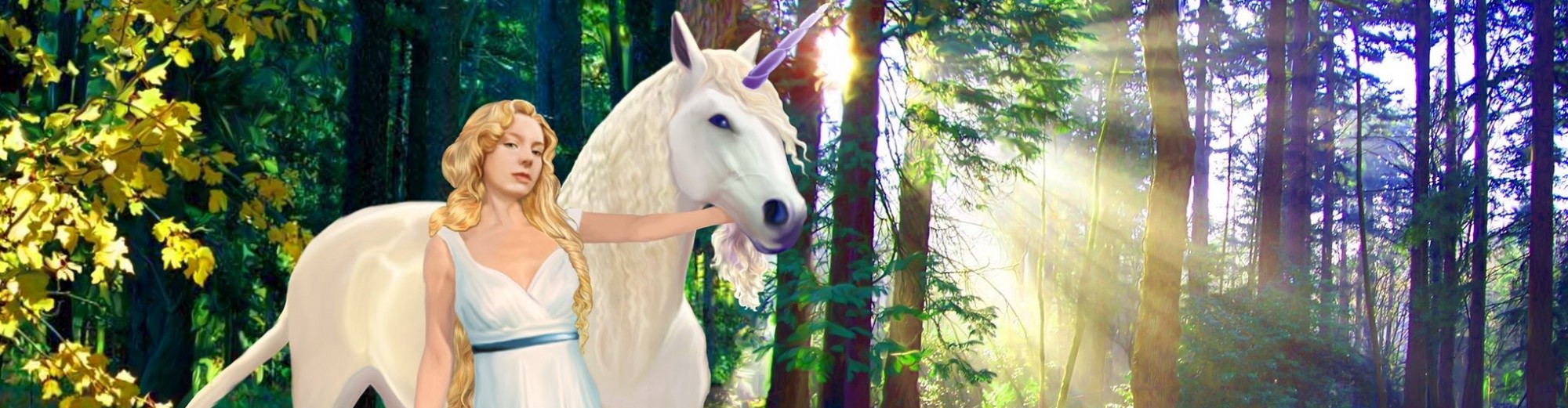
 I’m really proud that the debut of my “Fantasy Maidens and Beasts” Creative Coloring went so well at North Texas RPG Convention during the first week of June this year. My hat’s off to Texan hospitality! I am also pleased with the very favorable and encouraging comments I received from everyone who found their way to my art table at the con. Thanks for buying a coloring book! You guys are awesome!
What I think is particularly innovative about my coloring book concept is that it invites participation in story creation. Colorists can give names to the maidens and the fantastic animals associated with them. They can also make up narratives about who, why, where, when or what may be happening on the page.

Thanks for your patronage!